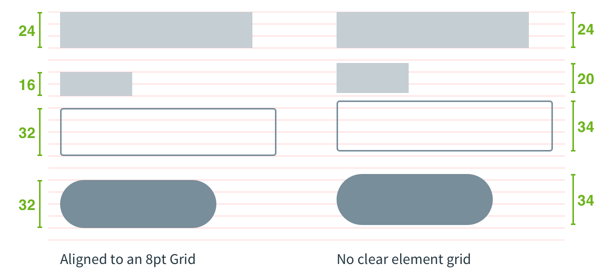
8-point grid
Pivotal UI uses an 8-point grid system for sizing, spacing, and laying out components relative to one another. This means that any padding, margin, button height, etc. is always a multiple of 8 pixels. This makes it easy to compose Pivotal UI components together neatly and consistently. For a deeper dive into how Pivotal arrived at the 8-point grid, read this article.

Using the 8-point grid
Pivotal UI incorporates the 8-point grid in several ways for different use cases.
Form, Panel & Table components
Components like the Form, Panel and Table have the 8-point grid built in, so using them means getting the benefits of the 8-point grid for free. For example, the Form lays out all of its fields and labels according to the grid. For more information, see the individual component pages.
Grid & FlexCol components
When more control is needed over layout, or when implementing custom components, the Grid and FlexCol components can be used to lay out content according to the 8-point grid. For more information, see the Grids page.
Margin & padding modifiers
The margin and padding CSS modifier classes (e.g. mtxl, paxxl) make it simple to add spacing around elements in increments of 8 pixels. The l indicates 8 pixels, xl indicates 16 pixels, and so on. For more information, see the Whitespace page.